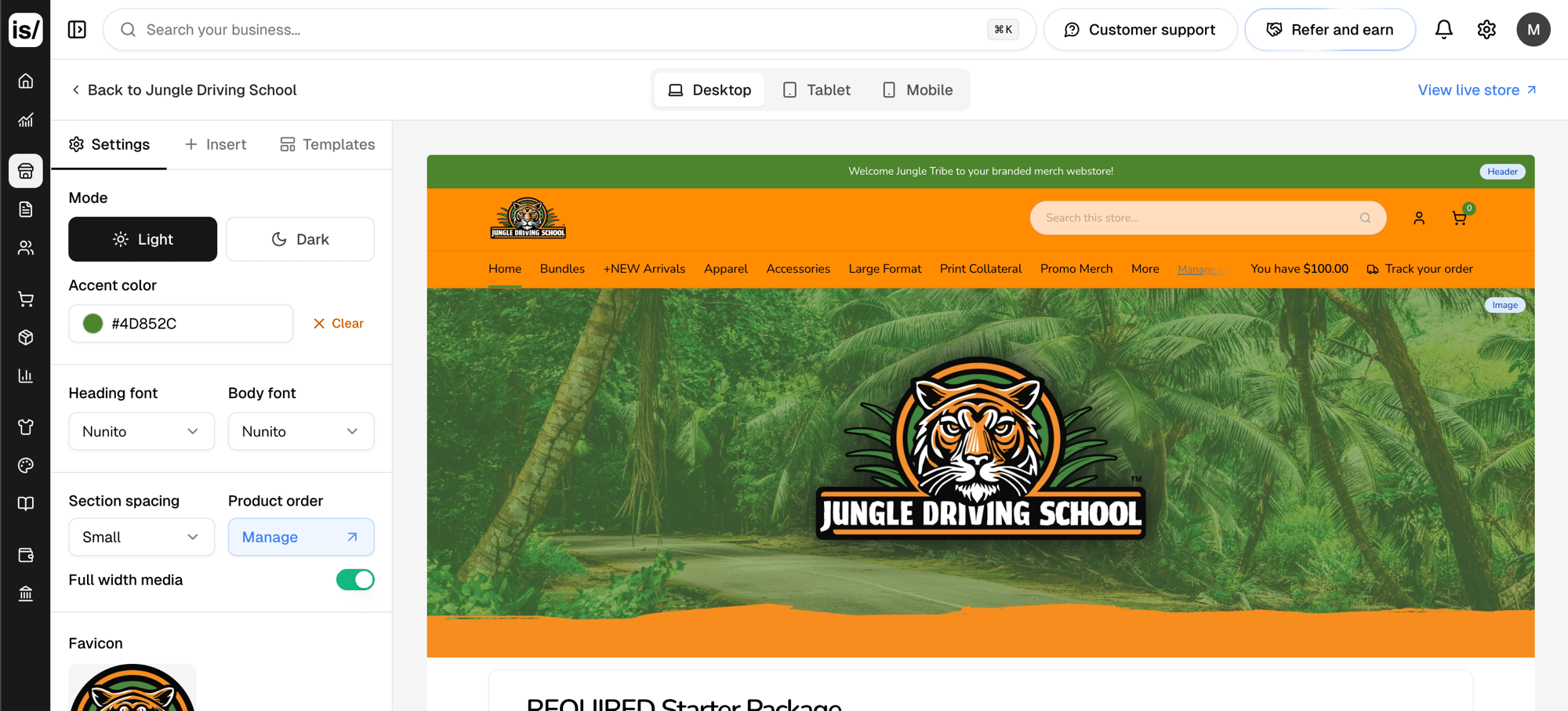
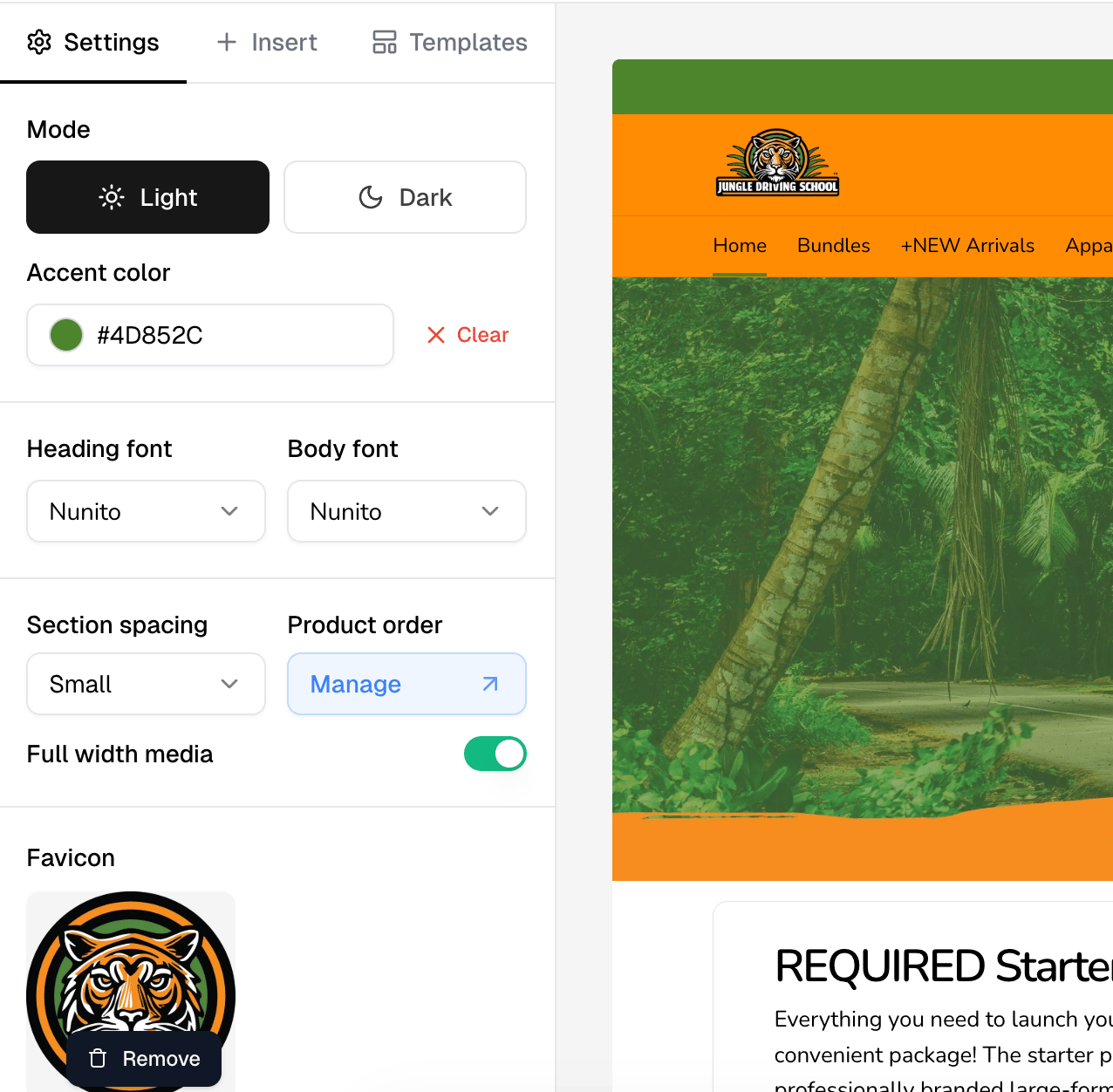
Settings
Applies to the whole store, not one section.
Uploaded images are capped at 8 MB.
Insert
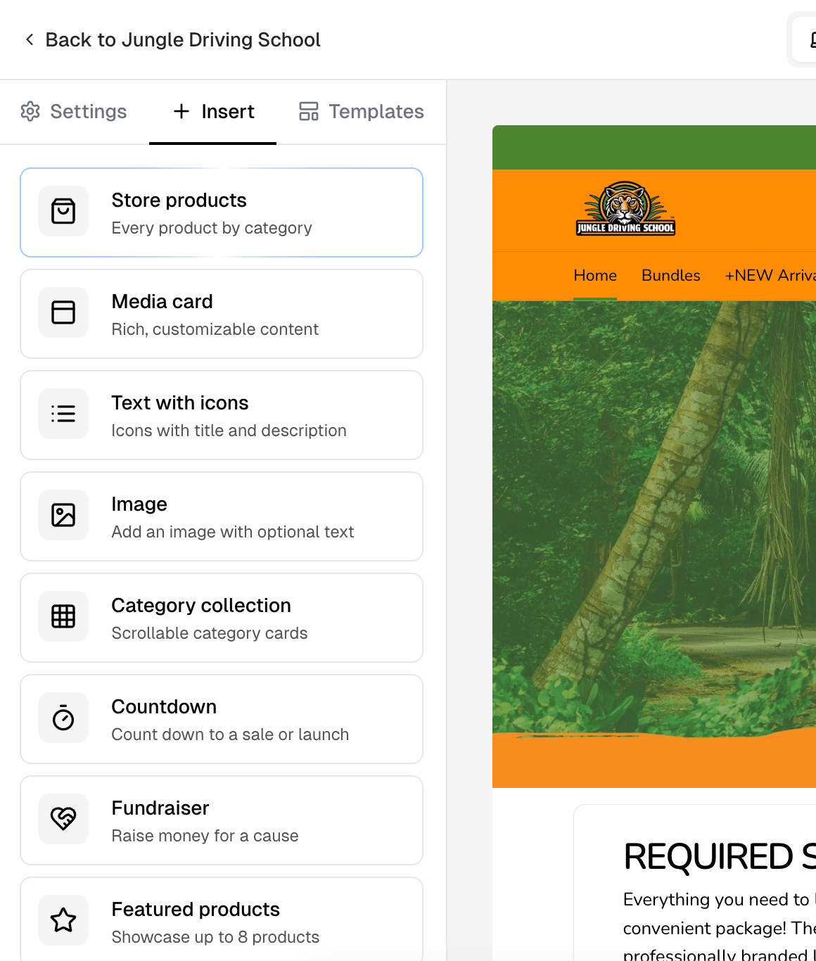
Insert adds a section. Select a card to add it at the end of the page, or drag it into the preview to drop it between two sections. Each option says what it is:
Most sections can be added as many times as you like. Store products,
Store bundles and Fundraiser are the exceptions: one each per store.
Once one is on the page its card greys out and sinks to the bottom of the
list, so the ones you can still add stay at the top.
Editing a section
Select a section in the preview to open its panel. Fields differ by section type, but most offer a title, a rich text description, a background image and color, a text color, a fixed height, and content alignment. Hovering a section also shows a small toolbar in its corner: a grip to drag it to a new position, a pencil that opens the same panel, and a trash icon that deletes it. Store products and Store bundles have nothing to configure, so they show no pencil. Mobile settings hold a separate mobile height and mobile background image, so a section can be framed differently on a phone.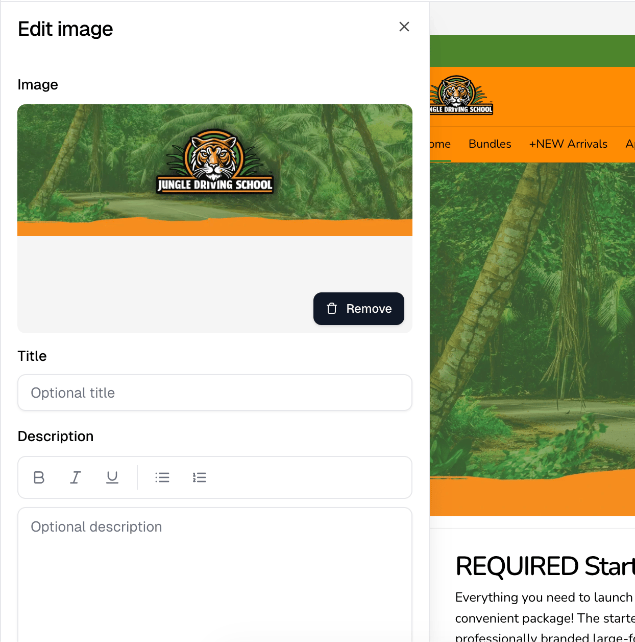
Buttons
Sections take up to two buttons. Use Add button, then set Button text and a Link. The first button is the primary one and the second is secondary, Add button disappears once both exist, and the trash icon removes one. Link is free text. A store path, a full URL, a bare domain, an email address and a phone number all resolve.Templates
Templates applies a saved layout to the store, and each one shows how many sections it carries. Save current website as template stores the current design so you can reuse it on another store.The header
Select the header in the preview to edit it.Banner bar
Show banner displays a bar above the header with links or a message. Set a Layout, either Centered message or Links left, message right, and a Message. The split layout also takes links: Add link adds one, each with its own icon, label and URL, up to 10. Banner background and Banner text color style it.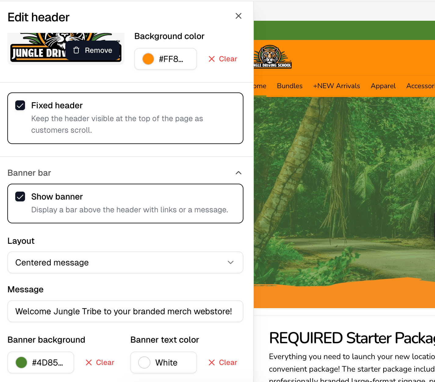
Header categories
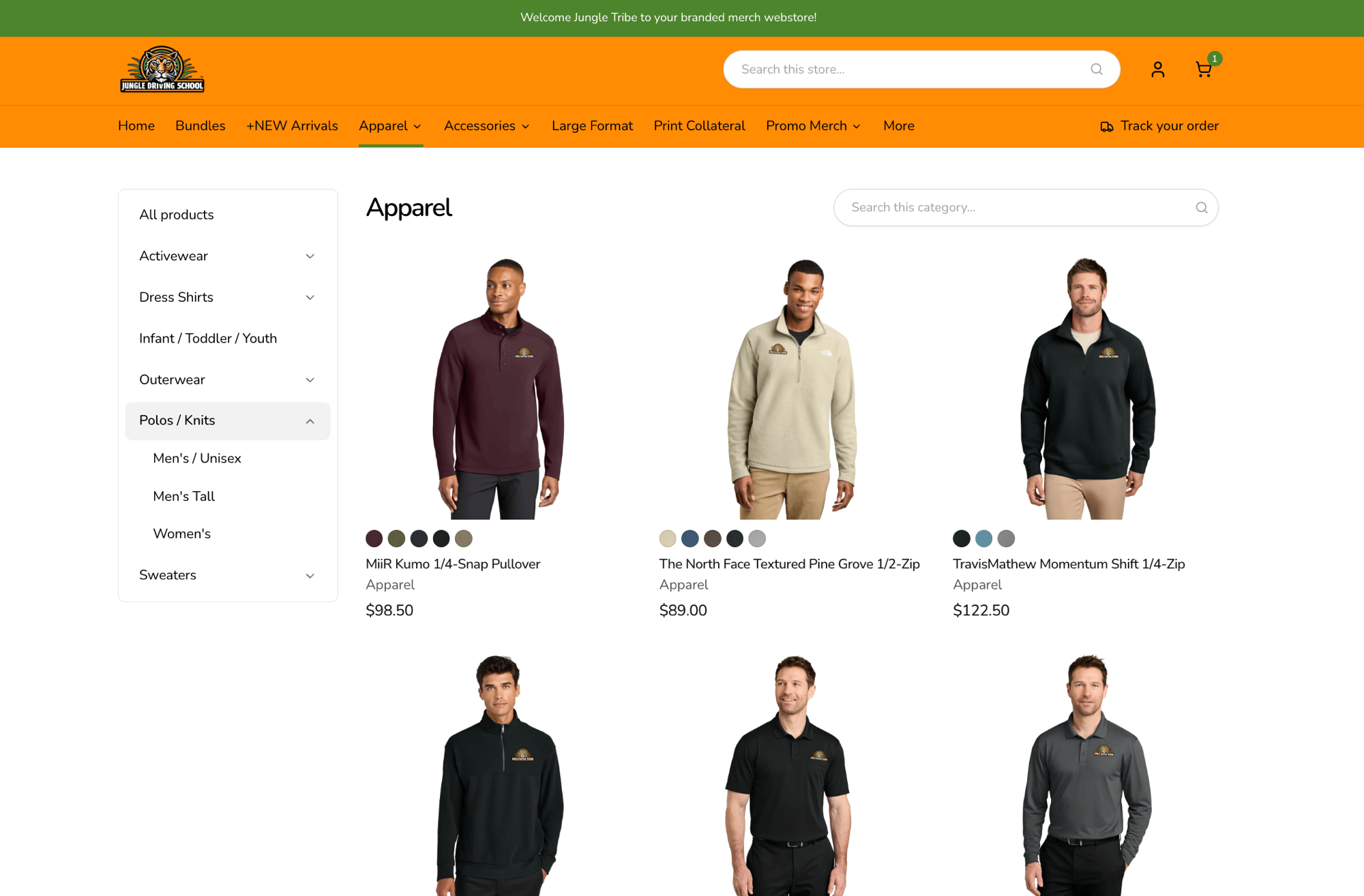
The categories along the header are not edited here. Top-level categories display as tabs in the store’s header, with their subcategories listed down the side of a category page. You manage them in the store’s settings under Basic information, with Manage categories.