Editing a product
A product opens on All, which stacks every section on one page. Five more tabs show one section each.Basic information
Name, description, SKU / style, and Primary decoration method, which is the default for every artwork on the product. On a print-on-demand product the decoration method is locked after import. Categories is here too, and a product can sit in several. Manage categories edits the category tree itself.Media
Images, grouped by color, with Color display order setting the order colors appear to customers. Artworks lists the designs already on the product, one per location, and lets you choose the colorway applied to each product color. Each location can also override the primary decoration method. Add artwork in that header opens the decoration tool for this product. The section appears only once a product has a design on it, so a blank does not show it. Drag images within a color to reorder them, and drag the colors themselves to change the order customers see.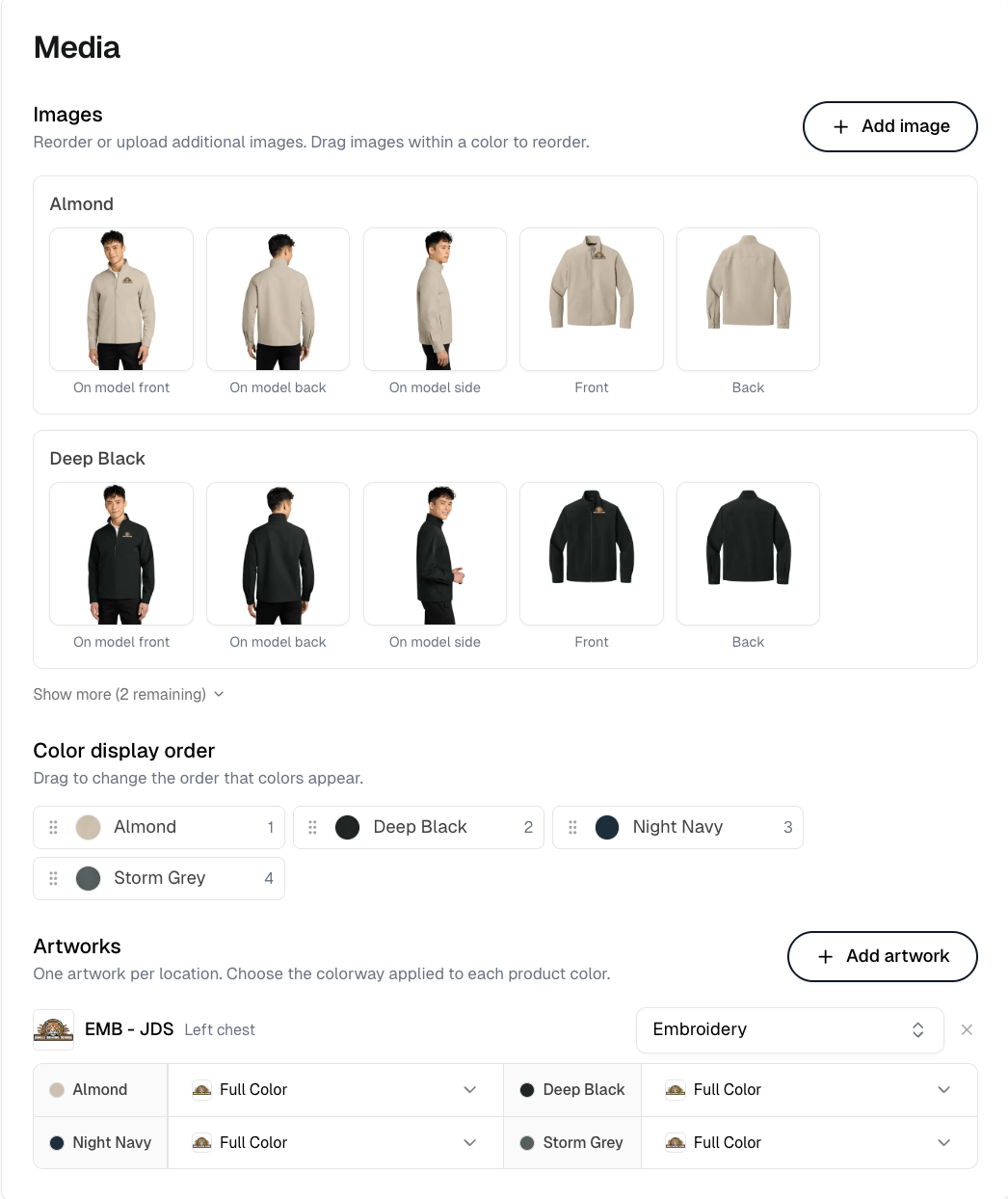
Product variants
What this tab holds depends on the product. A decorated catalog product gets Enabled colors, which controls what customers can pick. Disabled colors are hidden from customers on the storefront, which is how you remove a color without deleting anything. At least one color has to stay enabled. A blank imported from a catalog gets its color and size selection instead, and a product you define yourself gets Add variants.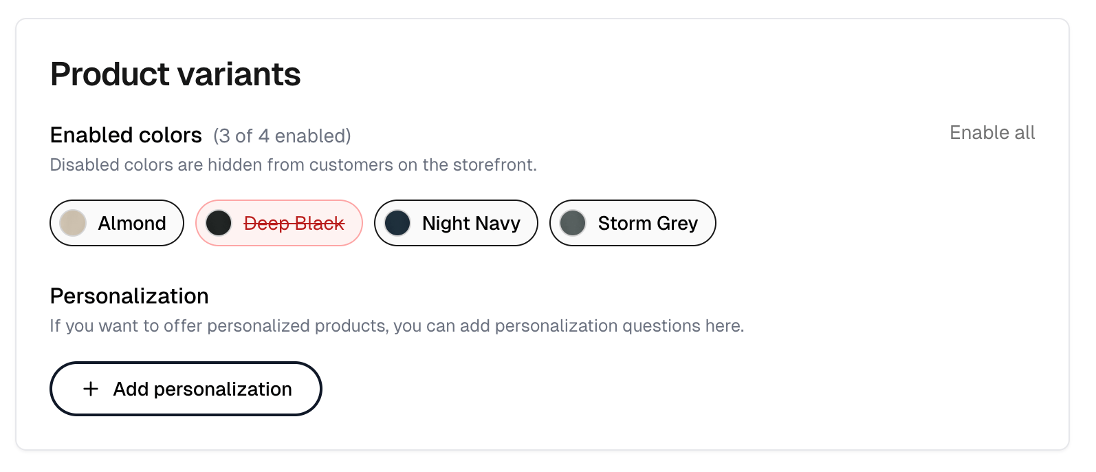
Personalization
Add personalization, below the colors on the Product variants tab, adds questions for products a customer personalizes. Add question adds each one, up to 10, so you can ask for several things separately rather than in one box. Type sets what a question accepts. File upload lets the customer attach files, up to four per question at 10 MB each. Personalization markup charges an extra fee when a customer personalizes the product. Print-on-demand products do not offer personalization.Pricing
A catalog product prices in a grid of color against size, so a 2XL can cost more than an M. A product with one price for every variant shows a single Price field instead. Add rule applies a pricing rule to this product. A product can carry several, and dragging them sets the order they are listed in, not the order they are applied in, which is fixed. List view swaps the grid for a flat list, with Group variants by to collect the rows under one attribute. Matrix view switches back, and is offered only when the product has exactly two attributes.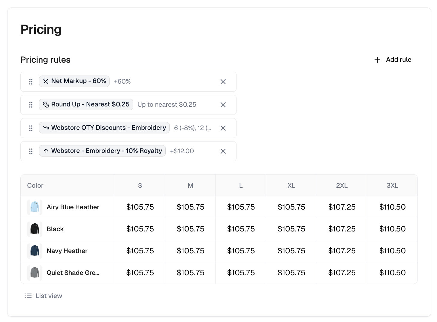
Advanced
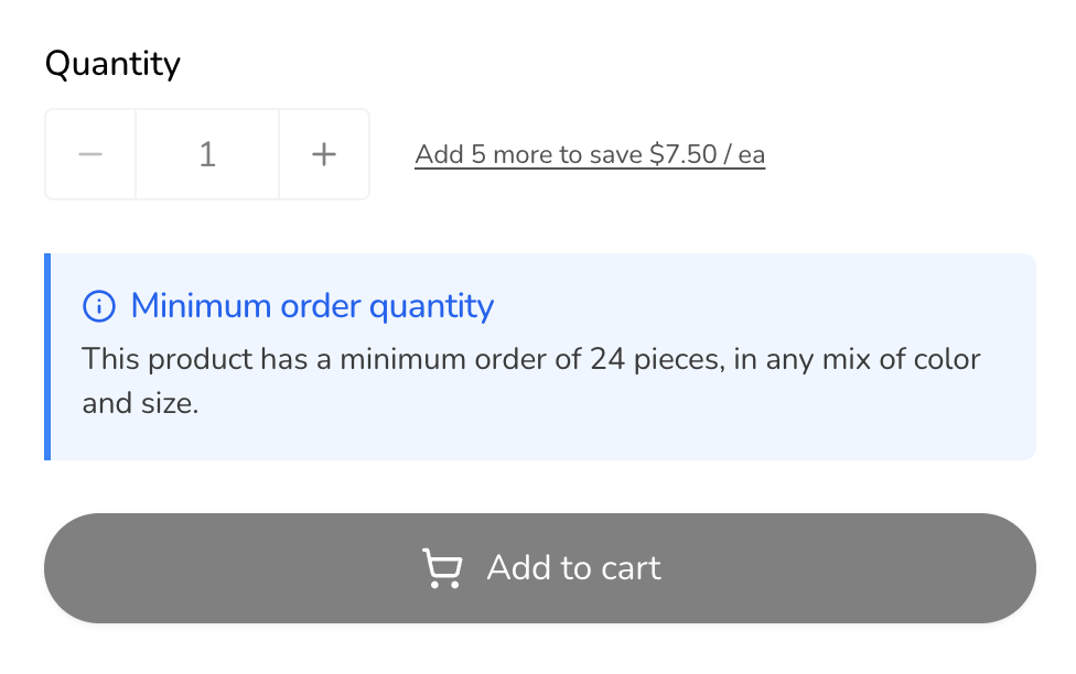
Item weight feeds shipping costs, and Varied weights lets each size carry its own, since a 2XL weighs more than an M. Getting these wrong makes calculated shipping quote the wrong price. Tax code assigns a product tax code for automatic tax calculation. Auto-stop selling treats a size and color as out of stock once supplier stock for it drops below your Minimum stock threshold. It is offered on products built from a supplier blank whose stock Itemstores reads, and the threshold field appears once you turn it on. Customers cannot pick an out-of-stock option on the storefront. Minimum order quantity requires customers to order at least that many of the product, in any mix of its options, before they can check out. Leave it blank for no minimum.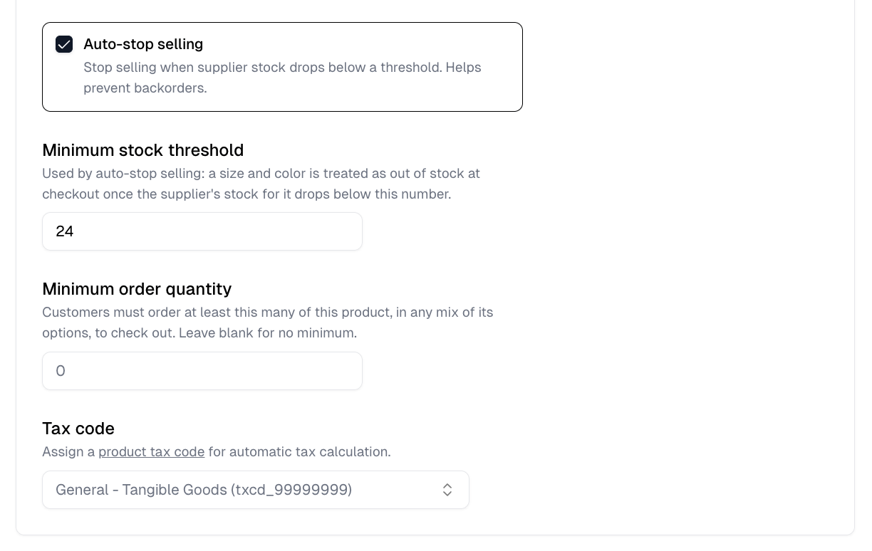
The right-hand panel
The panel beside the form stays on every tab, and it is desktop only. A product built from a catalog blank gets a placement editor there, not a preview. It shows where each design sits on the product and lets you drag, resize and rotate that placement. Editing for all colors and Editing this color only switch between one placement for the whole product and an override for the color you are looking at, and Reset drops an override back to the general placement. Changes here save with the rest of the form. Above it, Decoration tool opens the design builder for a blank. On a decorated product, Update design opens the same tool with the product’s current design loaded. It edits this product rather than creating a new one. Turning a placement off removes it when you select Save design, and the product’s colors stay as they are. Below it, Notes are internal and never shown to customers, and Performance reports quantity sold, revenue and orders containing the product.Custom products
A product you define yourself, rather than one built from a catalog blank, works a little differently. Add variants on the Product variants tab starts it, and selects Color and Size for you. Choose variant attributes picks up to five attributes to build variants from. Color and Size are the only two offered out of the box. Add custom attribute creates any other, such as Pack size or Flavor, and Manage custom attributes edits the ones you made. A custom attribute belongs to your business, so it is available to every product afterward. Each attribute holds its own options, up to 150, such as pack sizes of 24, 48 and 96. The running Total variants count tells you how many combinations you are about to create, which climbs fast across several attributes. A product carries at most 1,500. Pricing is then per variant rather than a color and size grid, with a Visibility toggle on each, and Varied prices for when options cost different amounts.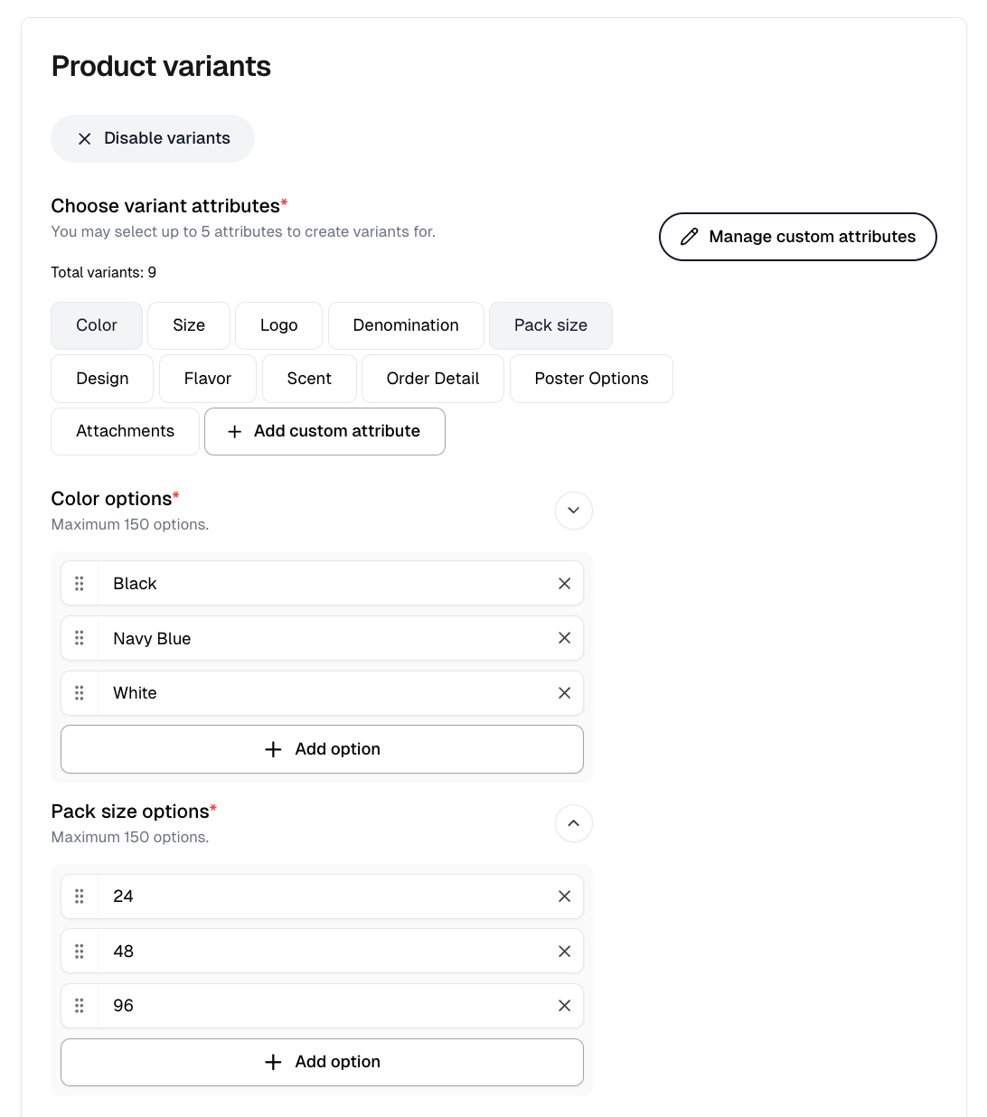
Grouping products
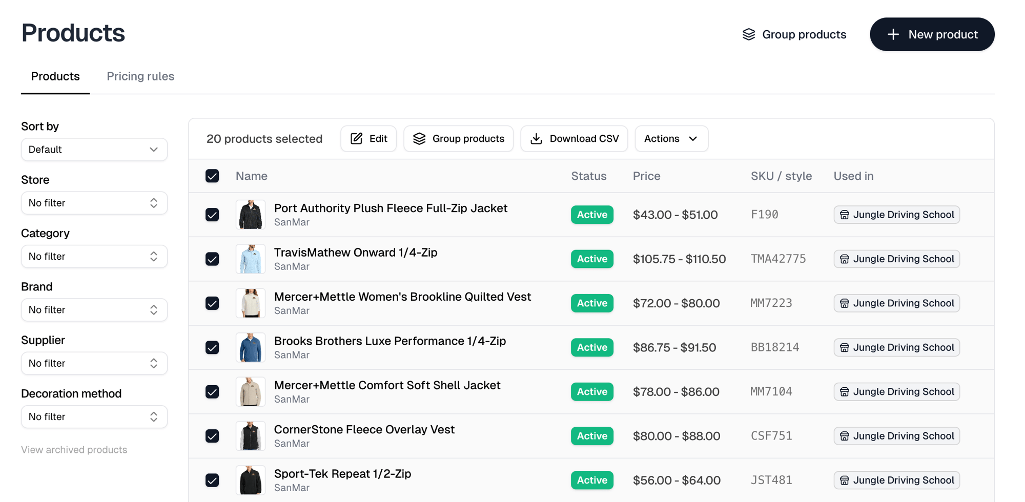
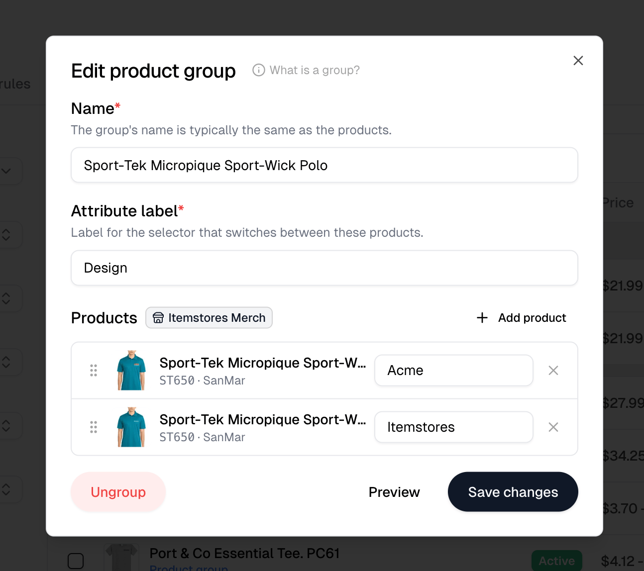
A group combines similar products into one storefront card, with each product listed as an option customers switch between. Use it when you sell the same garment in several designs. Group products at the top of the Products page opens an empty group. Selecting products first and using Group products in the toolbar fills it with them. Give the group a name and an Attribute label, which is what the storefront calls the selector, and defaults to Design. Add product adds each member. A group holds between 2 and 20 products. Each row also carries its own label, and that is what customers pick between. So a Design selector might offer Acme and Itemstores. Every label in a group has to be different, and the label defaults from the artwork applied to that product rather than its name, since members usually share a name. Drag the rows to set the order the options appear in. The top row is also the product the storefront card shows, so reordering changes which one represents the group. Preview shows the result and turns into Edit to go back. Create group saves a new group, Save changes saves an existing one, and Ungroup splits the members back into separate products without deleting any of them.Every product in a group must belong to the same store, and the store locks to
the first product you add. Blanks and products with no store cannot be grouped,
a product can belong to only one group, and the Attribute label cannot reuse
the name of an attribute the products already have, such as Color.
Changing many products at once
Select products to reveal a toolbar:
Edit runs one Operation over every selected product: Edit price, Edit
variant prices by attribute, Add pricing rules, Remove pricing rules, Edit
category or Edit tax code. Editing prices directly removes any pricing rules
from the products it touches.